
Support · Look and feel
Branding
Put your organization's name, logo, and colors on the helpdesk and its emails.
Branding makes the helpdesk look like yours: in the header, on the sign-in page, in every email, and on the phone home screen icon. Change what you like and click Save. Everyone sees it on their next page.
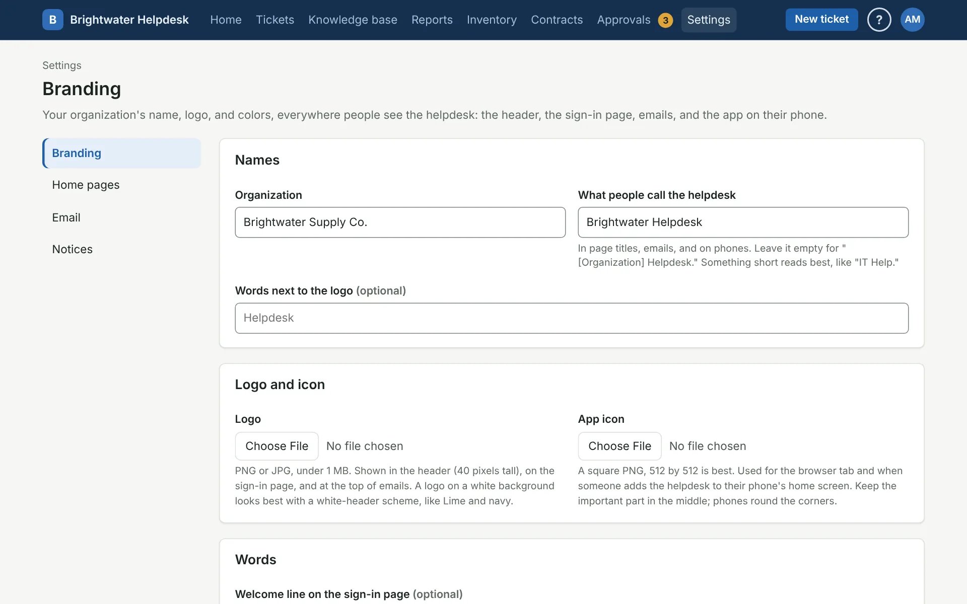
Names
- Organization is your organization’s name.
- What people call the helpdesk shows in page titles, emails, and on phones. Leave it empty and it’s your organization’s name plus “Helpdesk.” Short reads best, like “IT Help.”
- Words next to the logo is optional text beside the logo in the header.
Logo and icon
The Logo goes in the header, on the sign-in page, and at the top of emails. Use a PNG or JPG under 1 MB.
The App icon is for the browser tab and for when someone adds the helpdesk to their phone’s home screen. It has to be a square PNG, at least 192 pixels across (512 is best). Phones round the corners, so keep the important part in the middle.
To take either one off, tick Remove it under the picture and save.
Words
- Welcome line shows on the sign-in page.
- Help line shows on the sign-in page and at the bottom of emails. It’s a good spot for who to call when someone can’t get in.
- Email footer goes at the bottom of every email, like your department name and address.
All three are optional. To change what the emails themselves say, see Emails.
Colors
Pick one of the built-in color schemes, or Your own colors. Each scheme is checked so text stays readable, and dark mode follows each person’s phone or computer setting.
For your own colors, pick a Main color (buttons and links) and a Header color (the bar across the top). A light header gets dark text and a dark one gets light text. After you save, the page tells you if something would be hard to read, like a main color too light for links, which gets a darker shade, or a header that’s neither light nor dark.
If your logo sits on a white background, a scheme with a white header (like Lime and navy) looks best.
Every branding change goes to the audit log.
More on look and feel
Still stuck?
Search all the guides or write to us on the Support page.